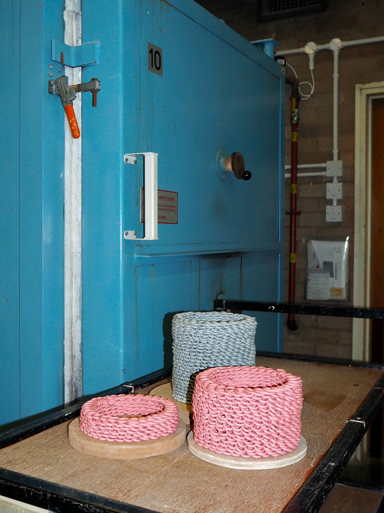
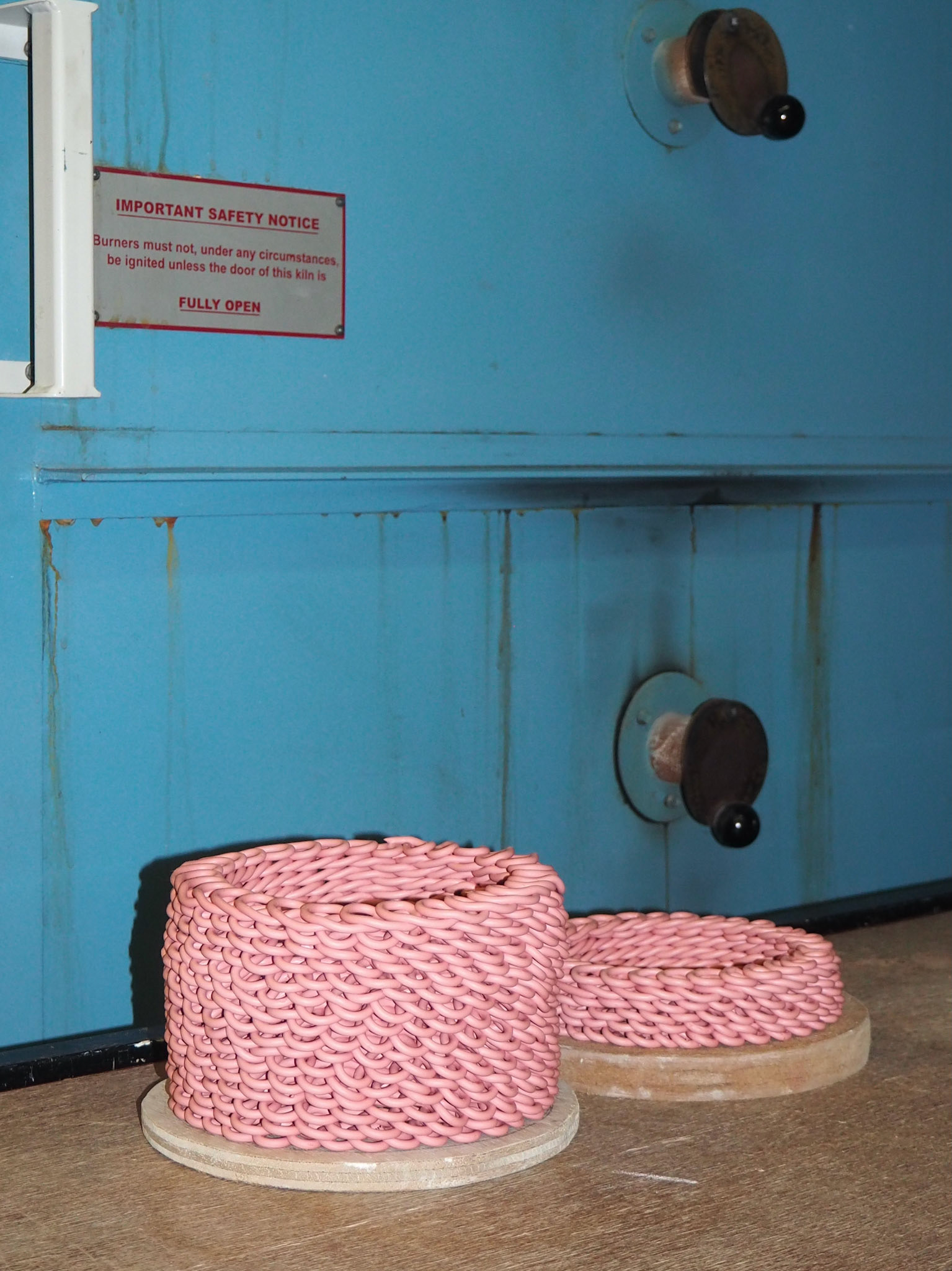
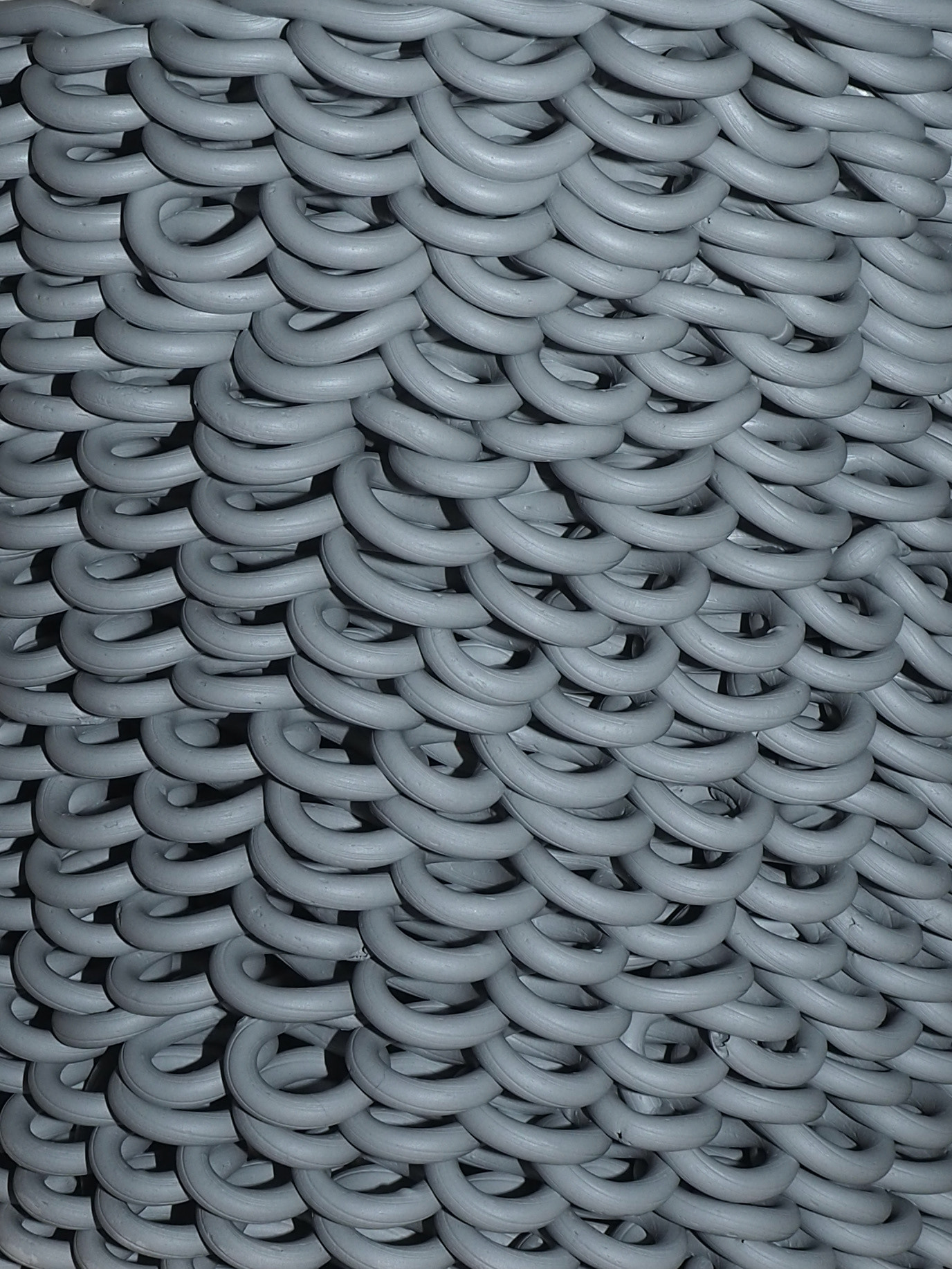
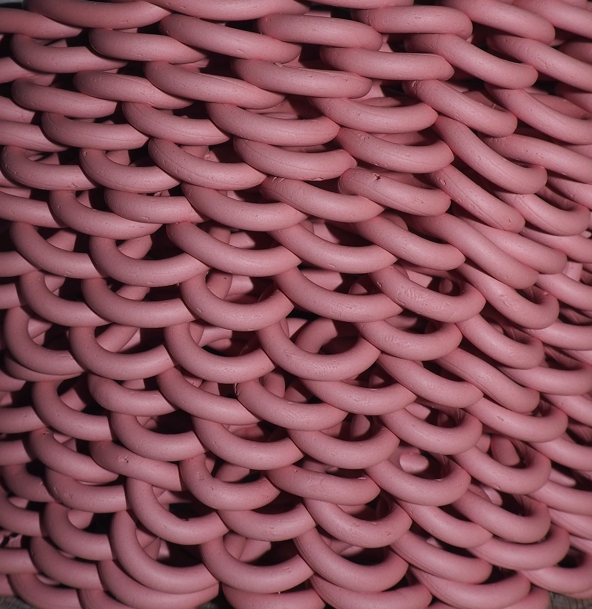
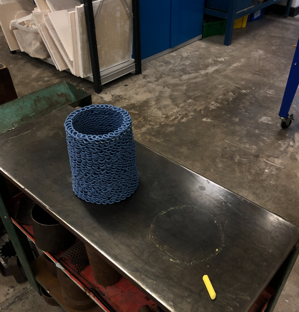
Looped porcelain vessels made to be part of the stacks. One is made using a red stain at 6% and the other is coloured using 0.5% cobalt oxide. I made these using a slightly bigger nozzle than the previous blue ones which give the pieces a looser, smoother loop, it makes them appear more soft and almost chewy. In a way I'm glad that the bigger blue pieces broke because this meant that I could wait for the bigger nozzle to arrive.
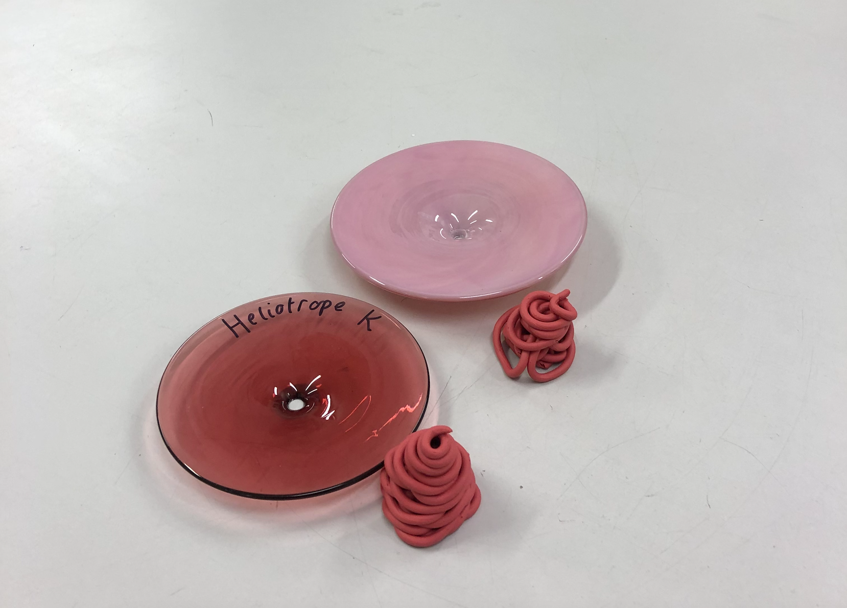
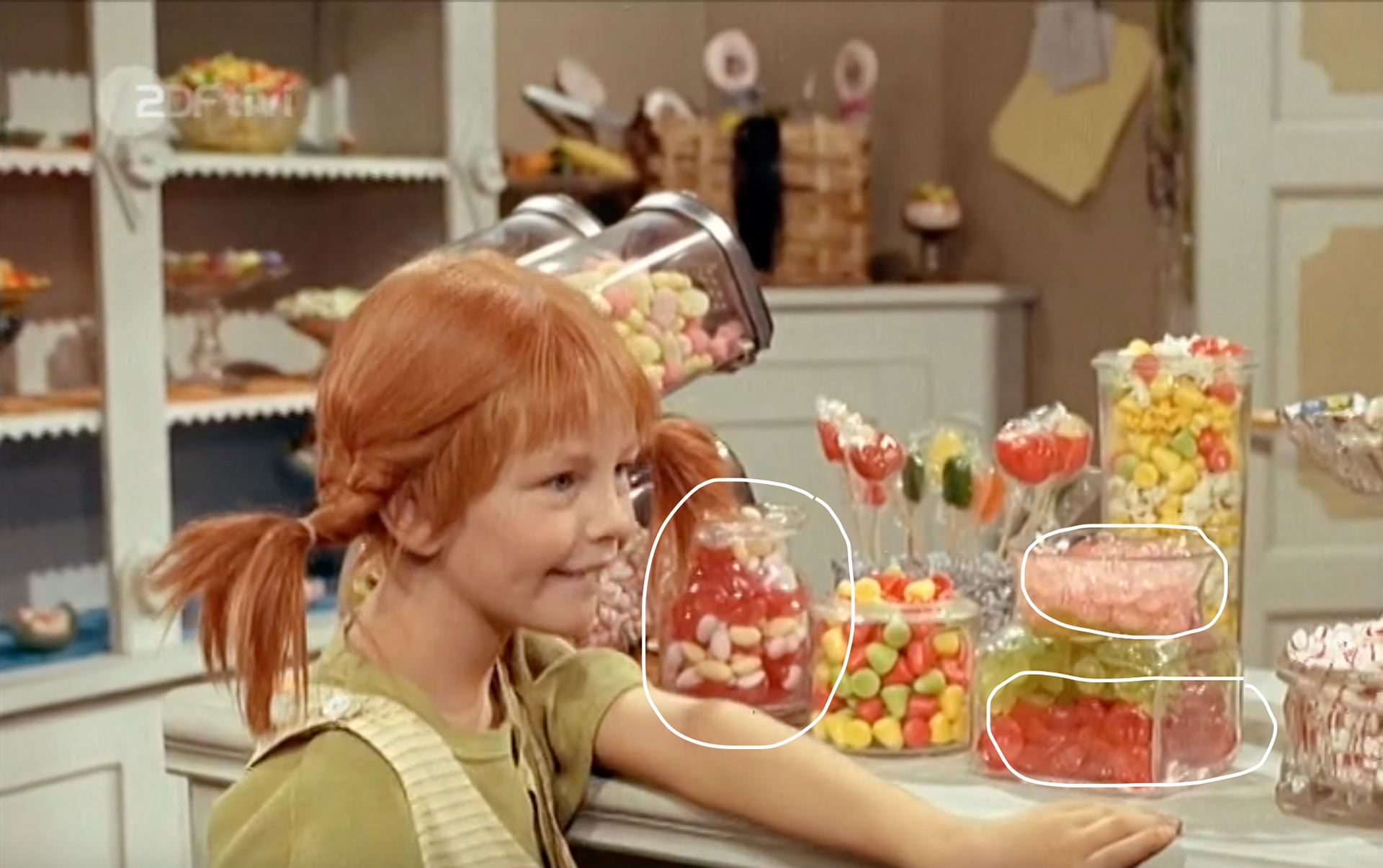
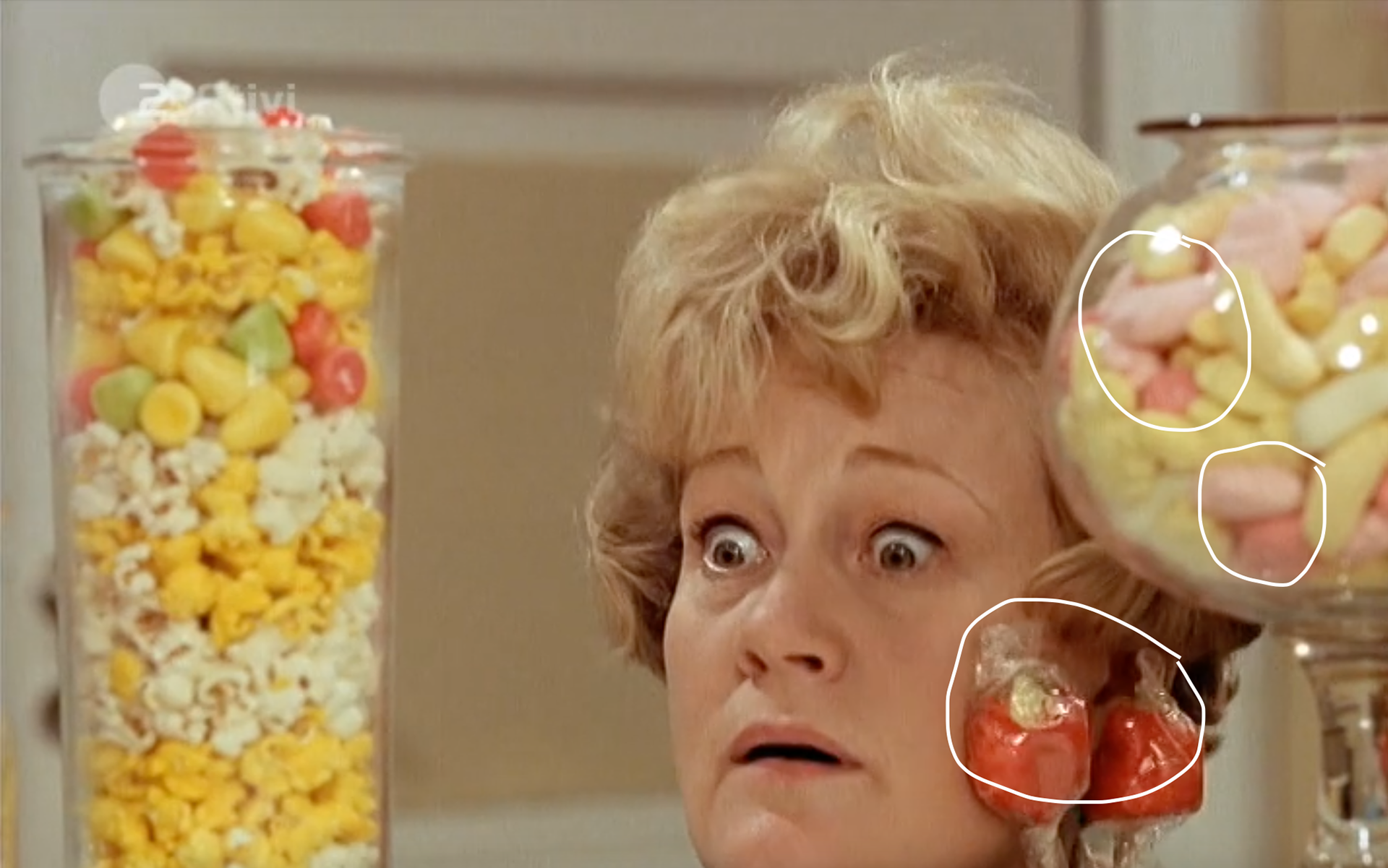
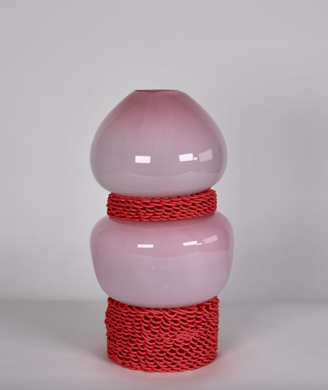
Making decisions on the colour of the glass component for the red stack. I was stuck between the shades of pink glass to pair with the red stacks (porcelain colour and form inspired by strawberry laces) so I looked back at the screenshots of Pippi Longstocking. There is an abundance of baby pinks paired with reds so that is what I ended up choosing. I want the colours in the stacks to represent playfulness and there is something playful about pink and red as a colour combination. I am fond of the darker pink but that combination feels slightly more 'grown up' which goes against what I'm trying to portray in my work.
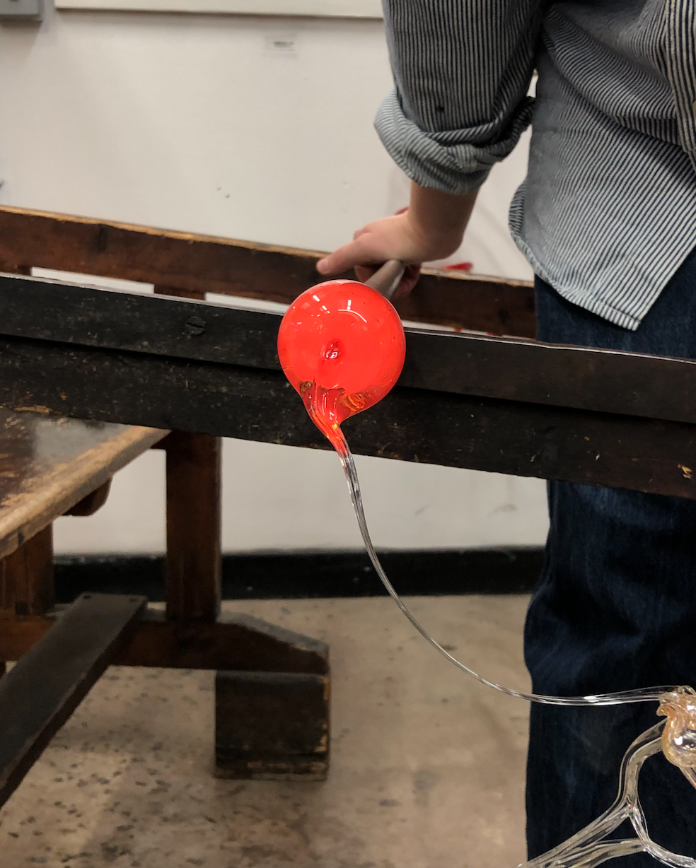
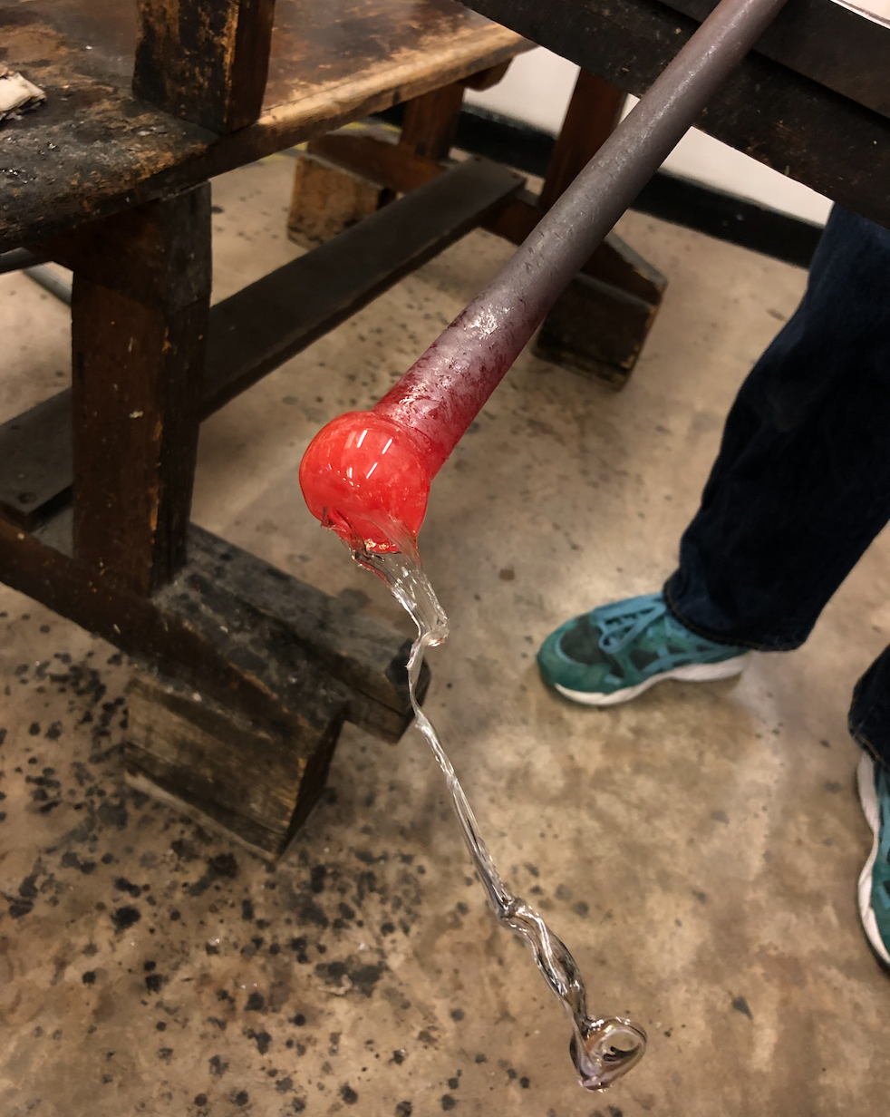
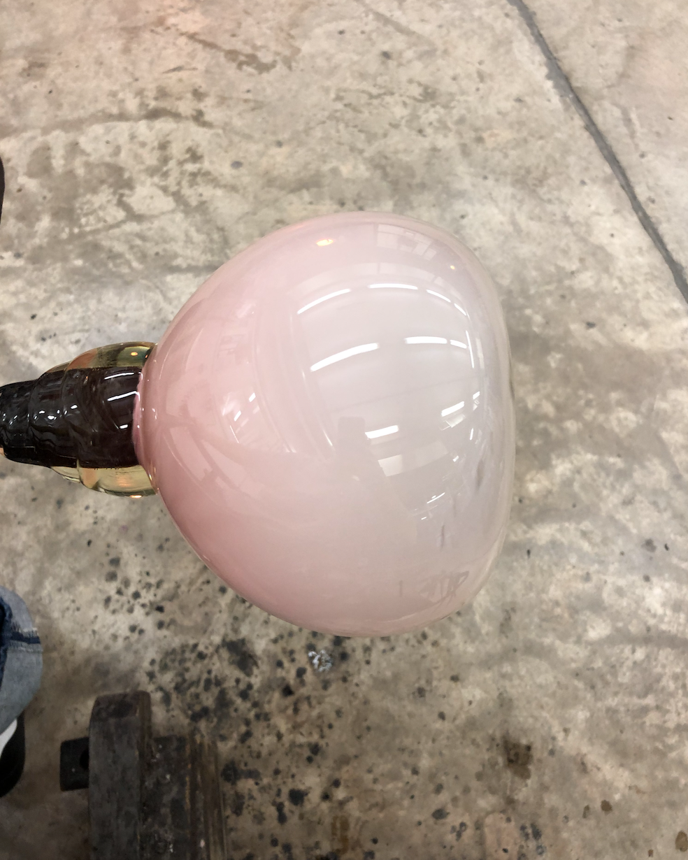
Blowing a bubble for my stack. Glass Blowing on a bigger scale is something I'm getting used to, I've made a few big pieces in the past but they have almost all gone off centre. In order to stop this I have started waiting for each layer to cool as much as I can before adding another layer of glass on top. This prevents the bubble from being misshapen from the heat. It takes much longer working in this way but I've learnt that when working on a bigger scale spending time do this at the beginning pays off.
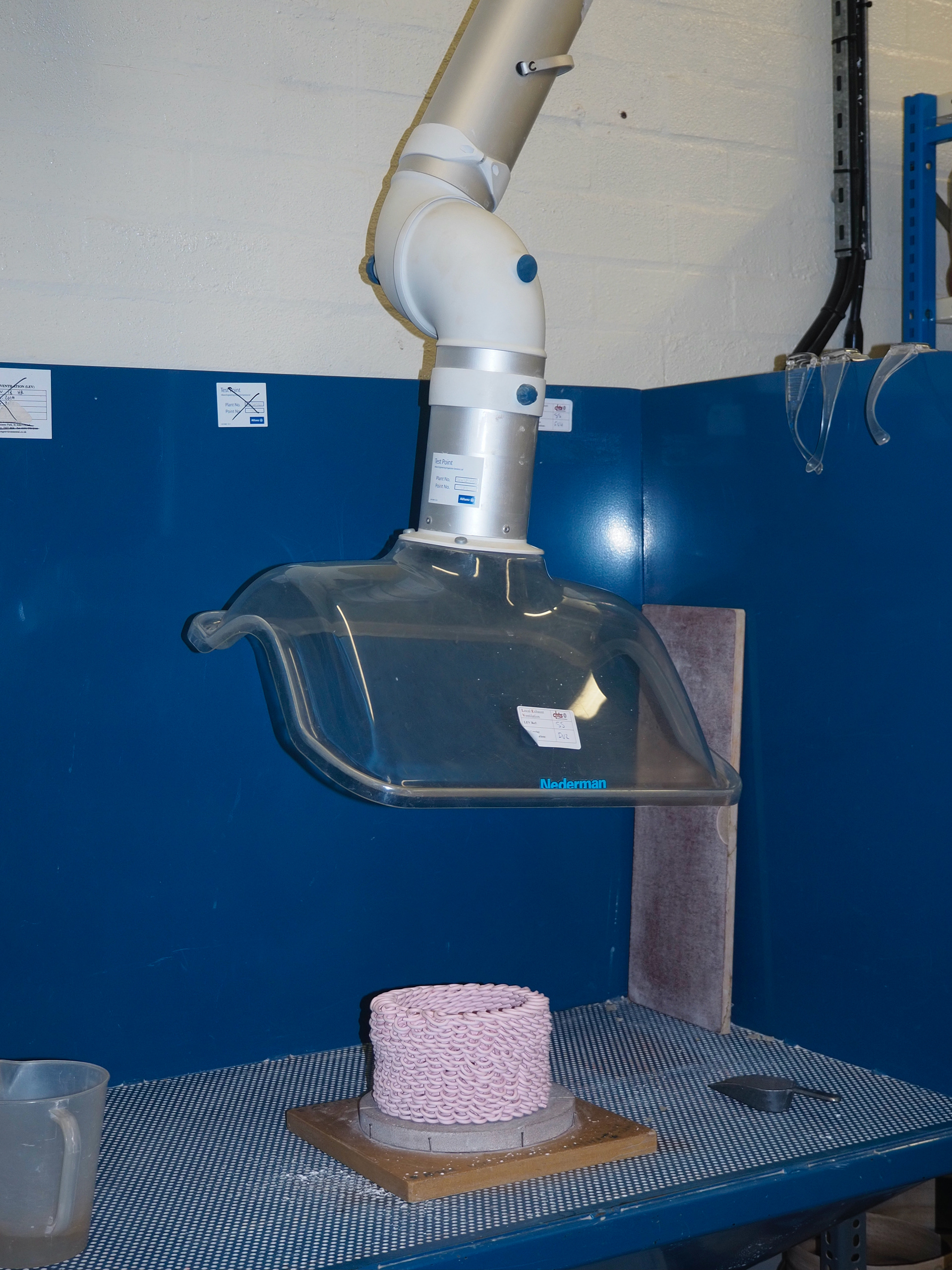
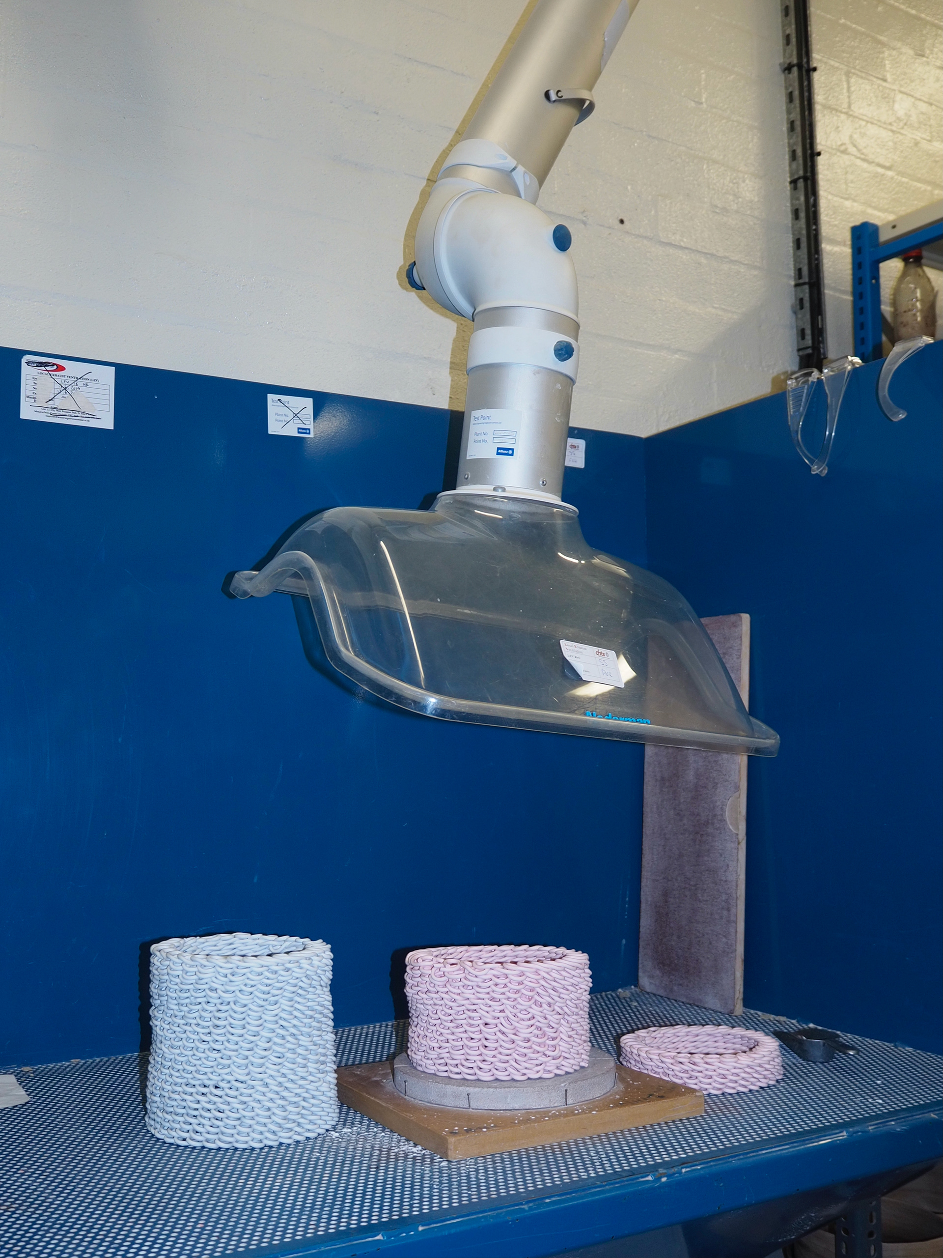
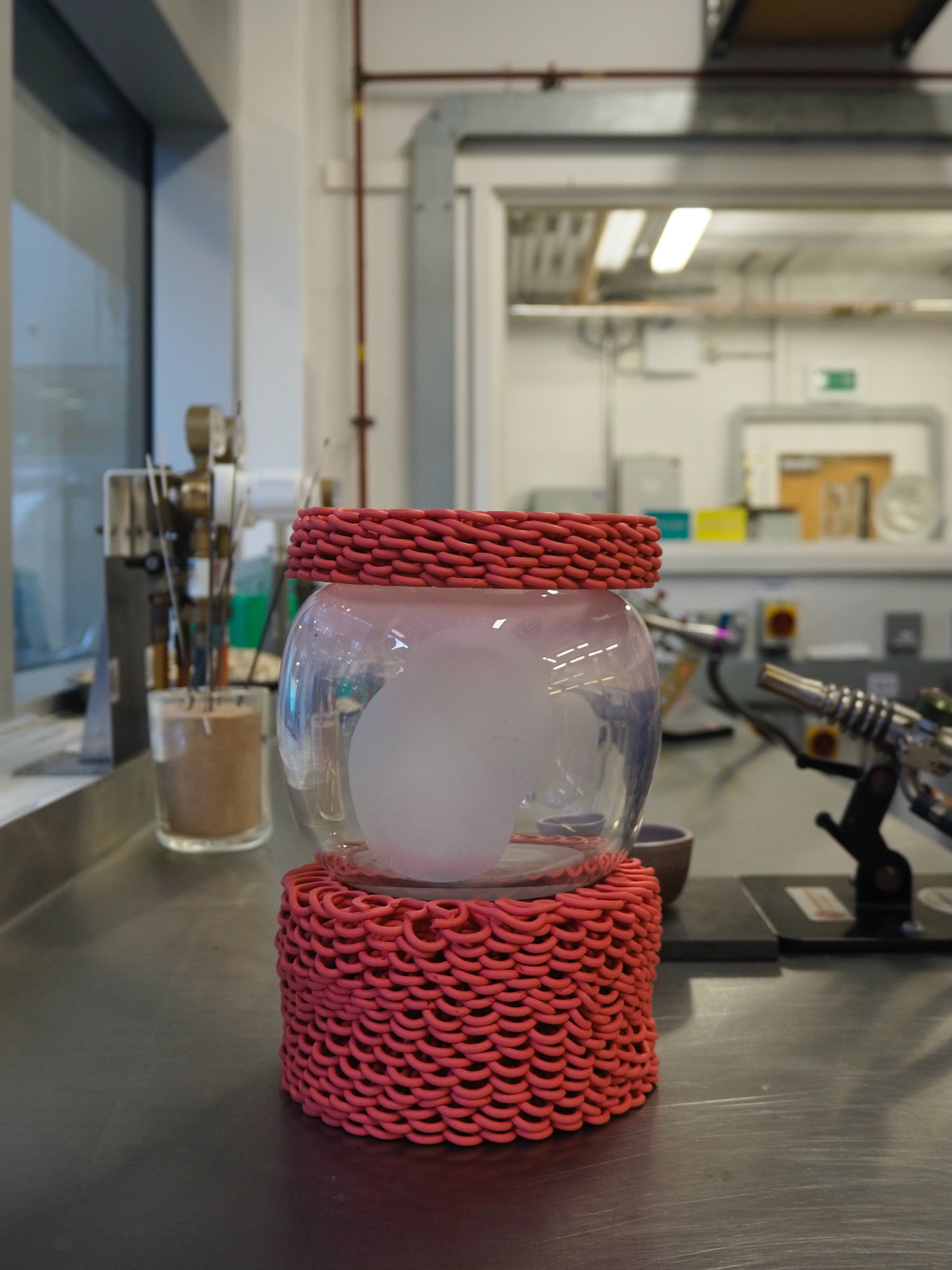
Something that I noticed with my previous looped object was that it didn't sit flush against a surface. I need the components of my stack to be as flat as possible in order to be able to glue each piece together. So I fired these pieces to bisque and then ground each side down using a rough surface with a little bit of water in order to create a fully flat bottom.
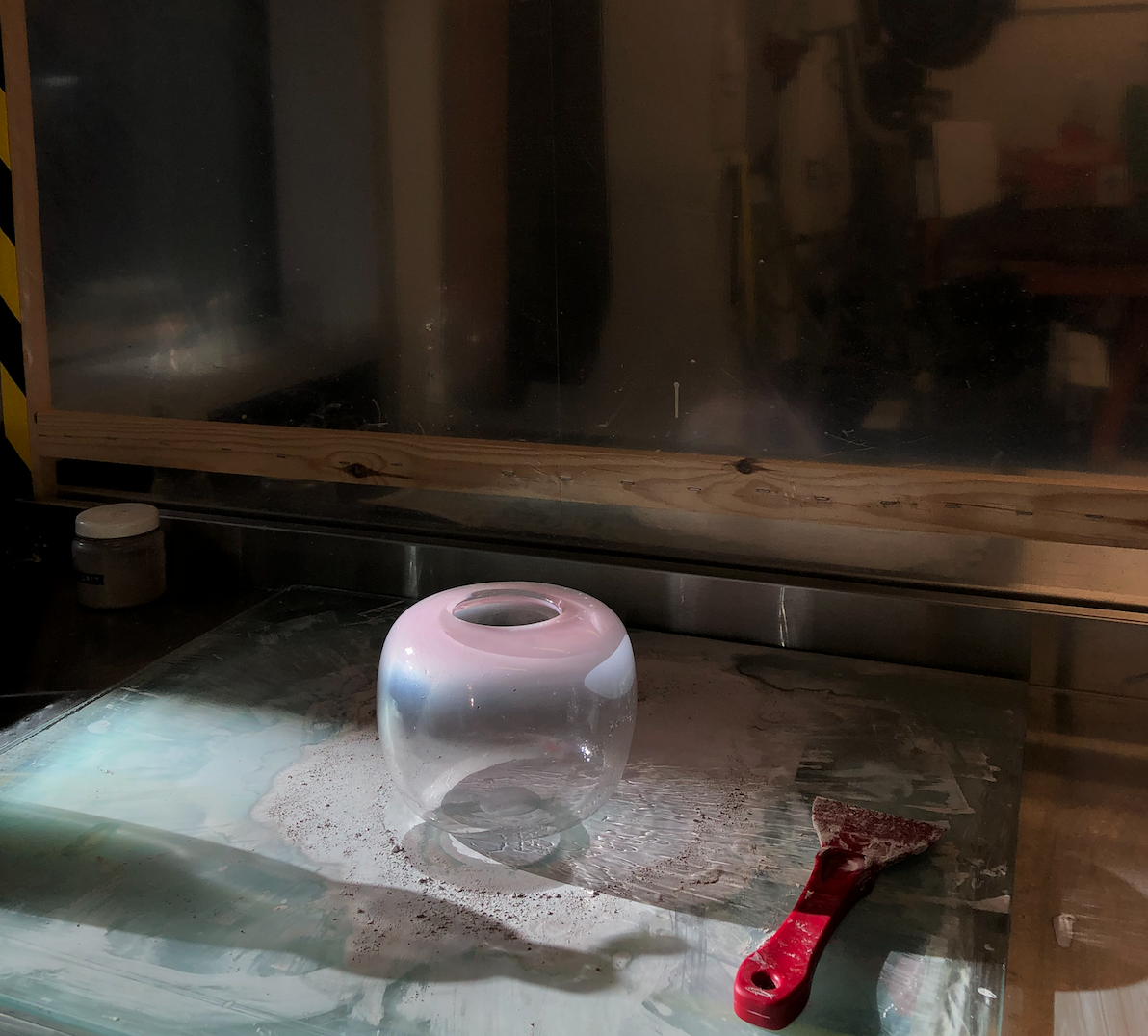
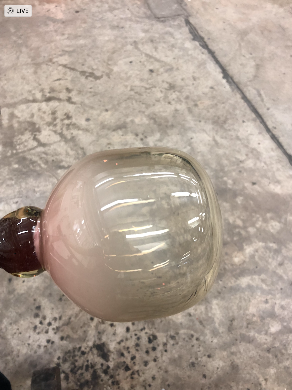
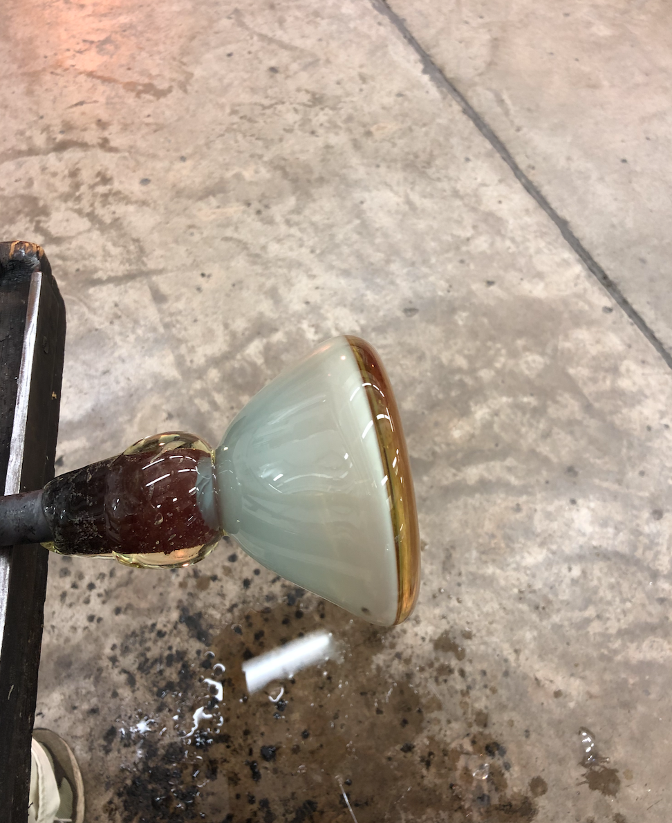
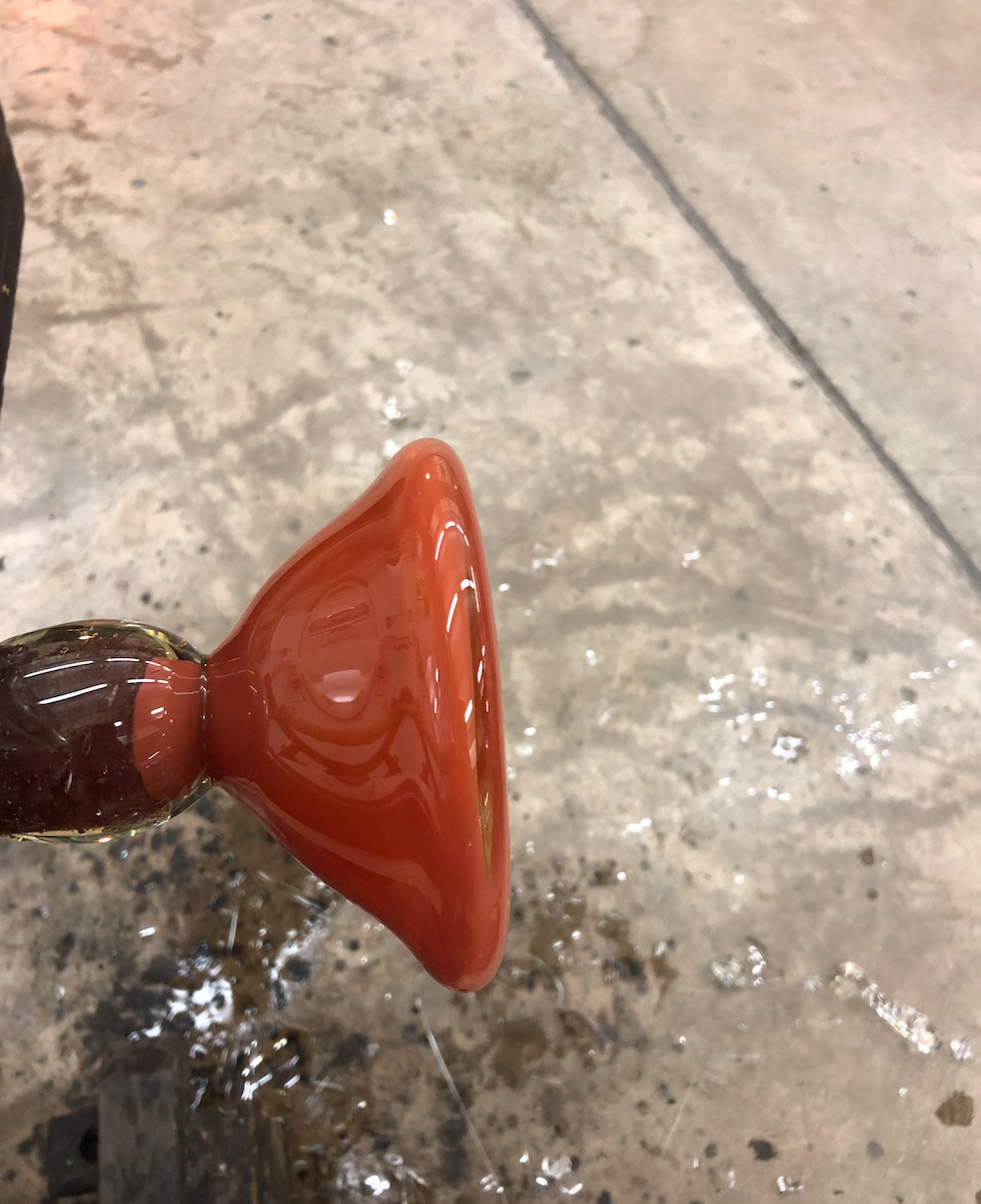
Cold working the punty mark, adding lenses and flattening the top and bottom of the piece so that it can be stacked and glued to the porcelain pieces.
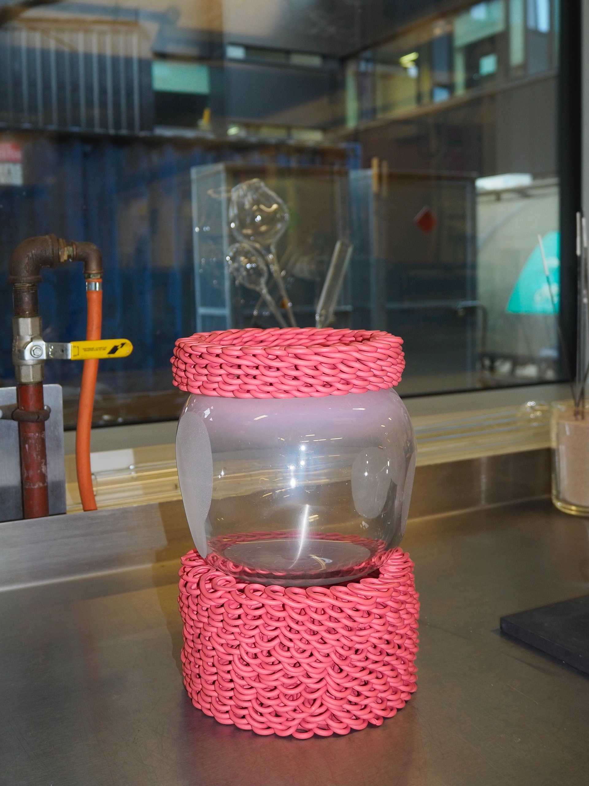
The porcelain pieces came out of the kiln and made me realise that my glass needs to be bigger in order for the pieces to have the right proportions and fit on top of each eachother. I also wanted the next piece I made to have more pink colour in because I thought it was quite lost in this stack.
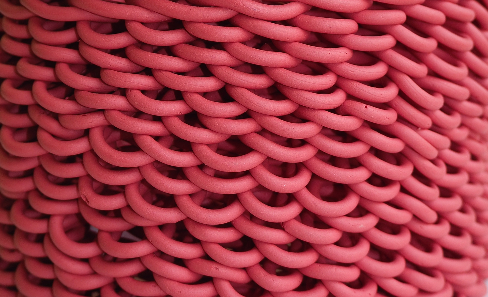
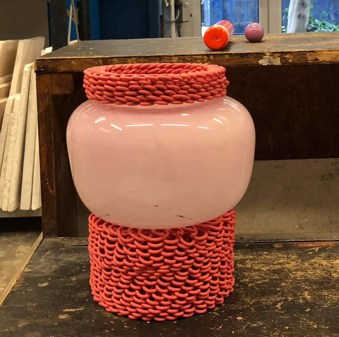
I am pleased with the texture of this piece, the colour and texture is a nod to childhood by imitating strawberry laces.
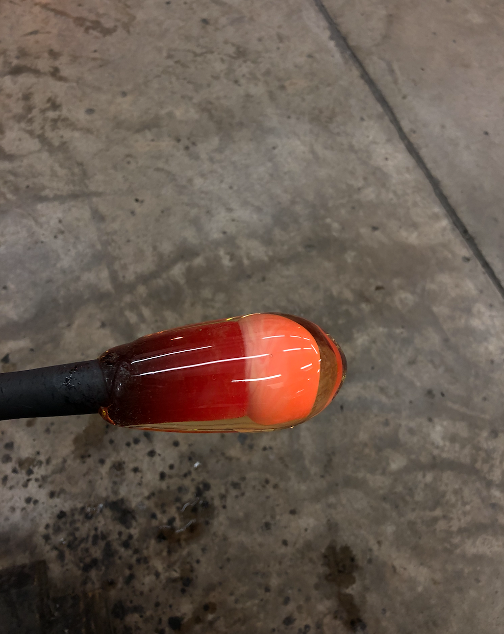
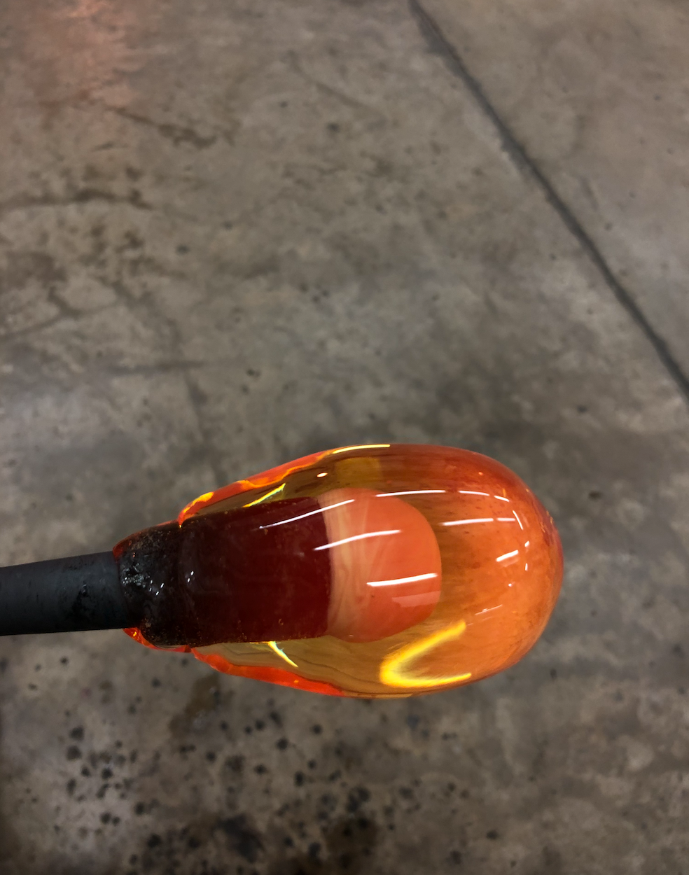
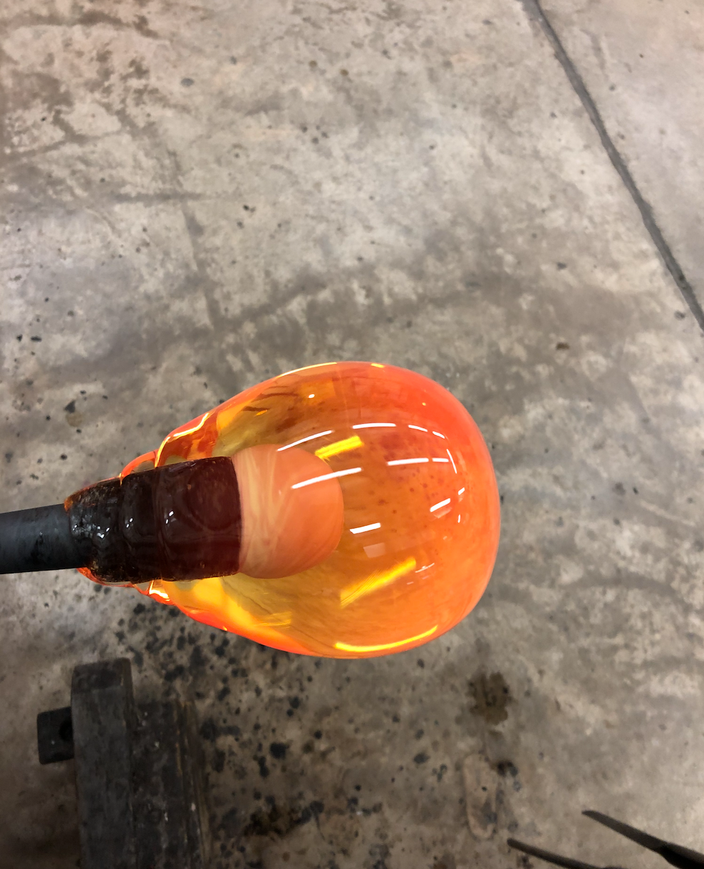
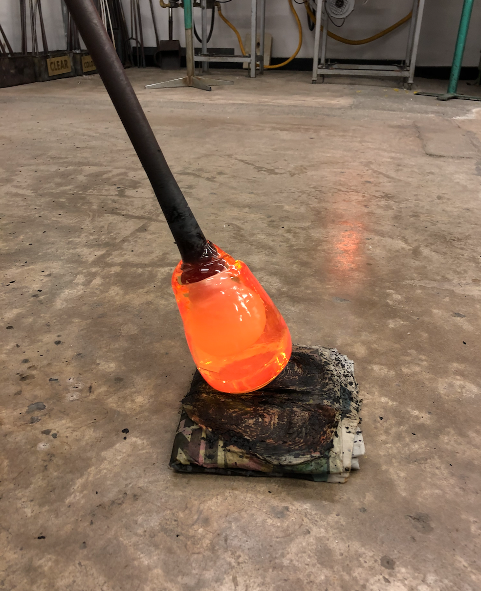
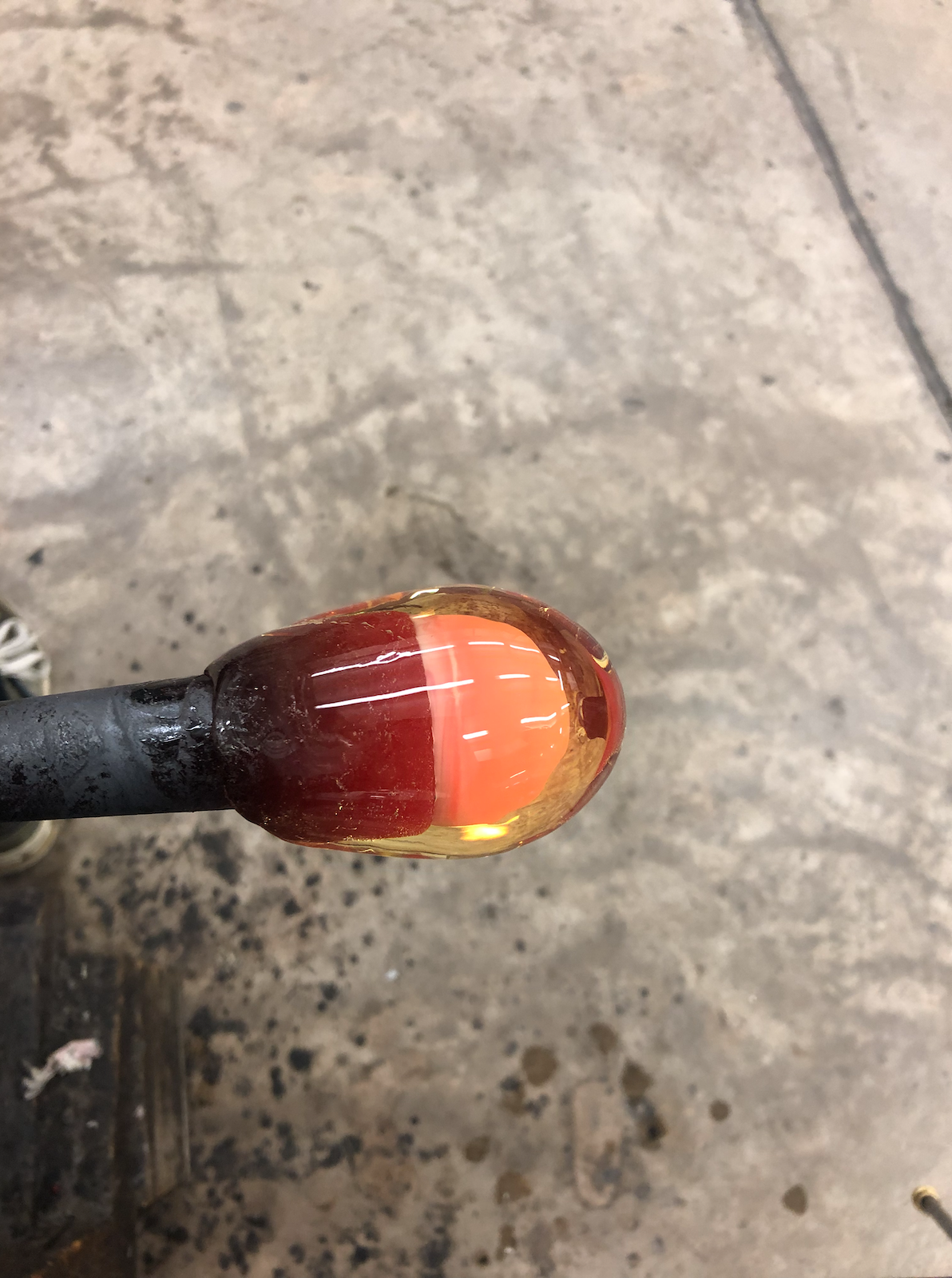
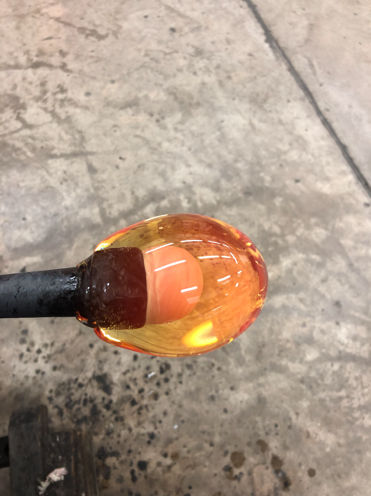
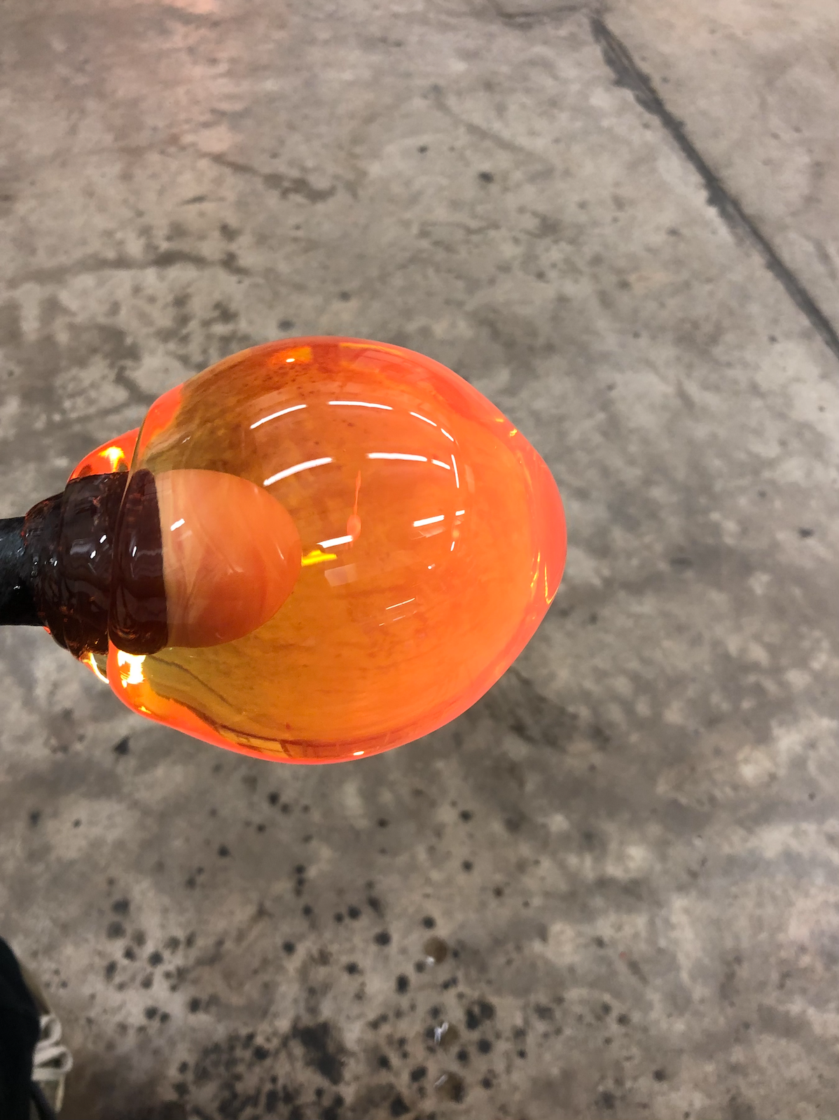
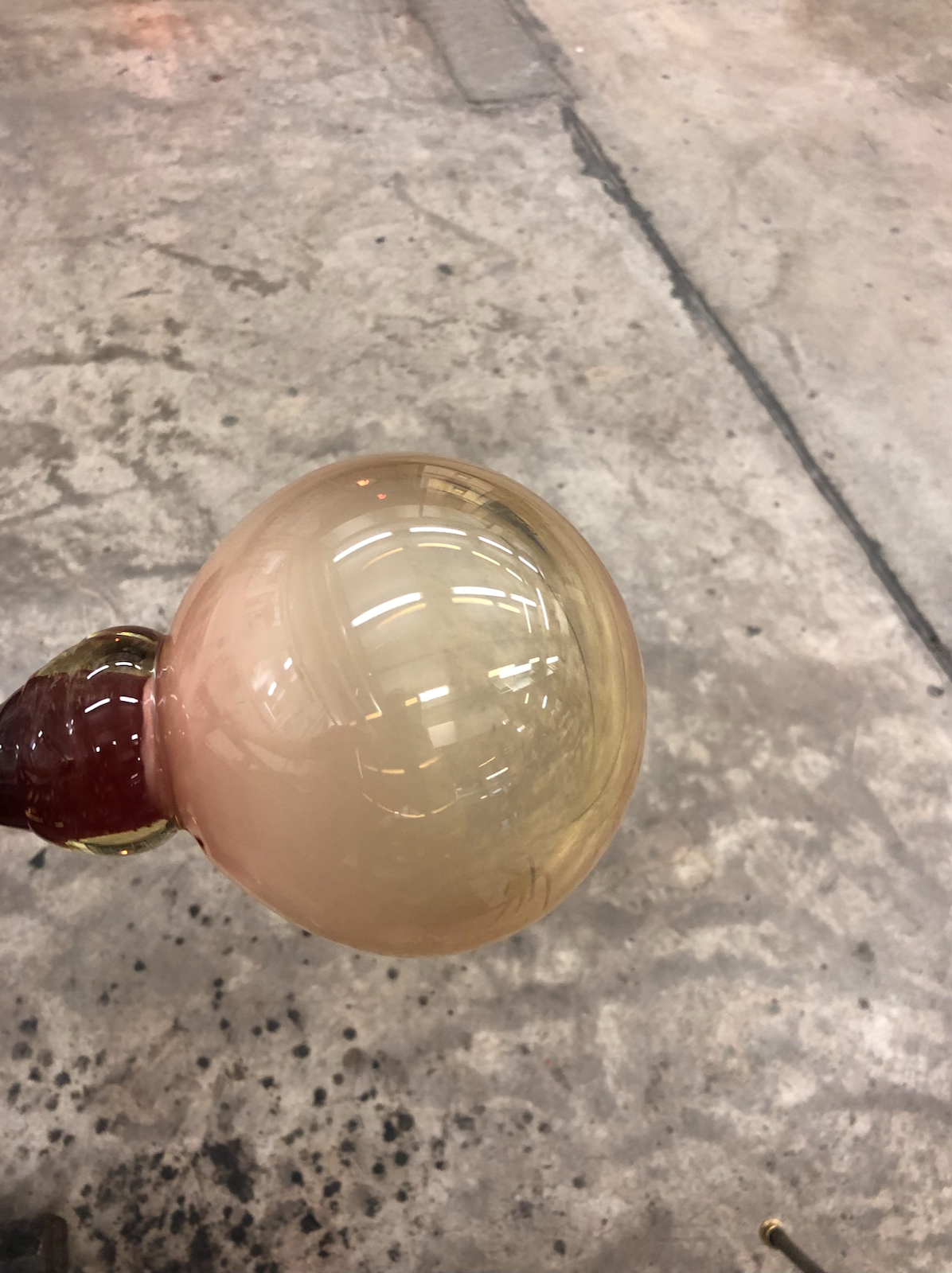
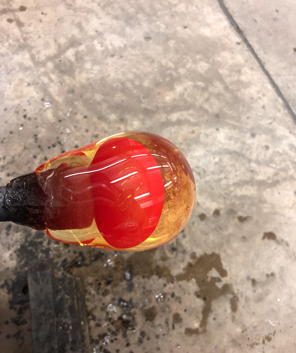
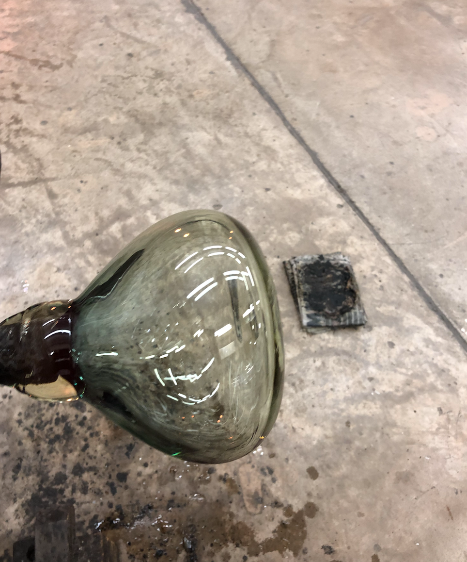
Blowing the bubble for my pink and red stack. This was quite a gruelling process because the piece was so big, I had to have both of the glory doors open in order to fit it inside and it was very heavy to carry between the bench and glory. When working on this scale, for me it is important to keep the piece on centre because the weight can easily throw it off. To avoid this, I build up in small gathers and adjust the size slowly.
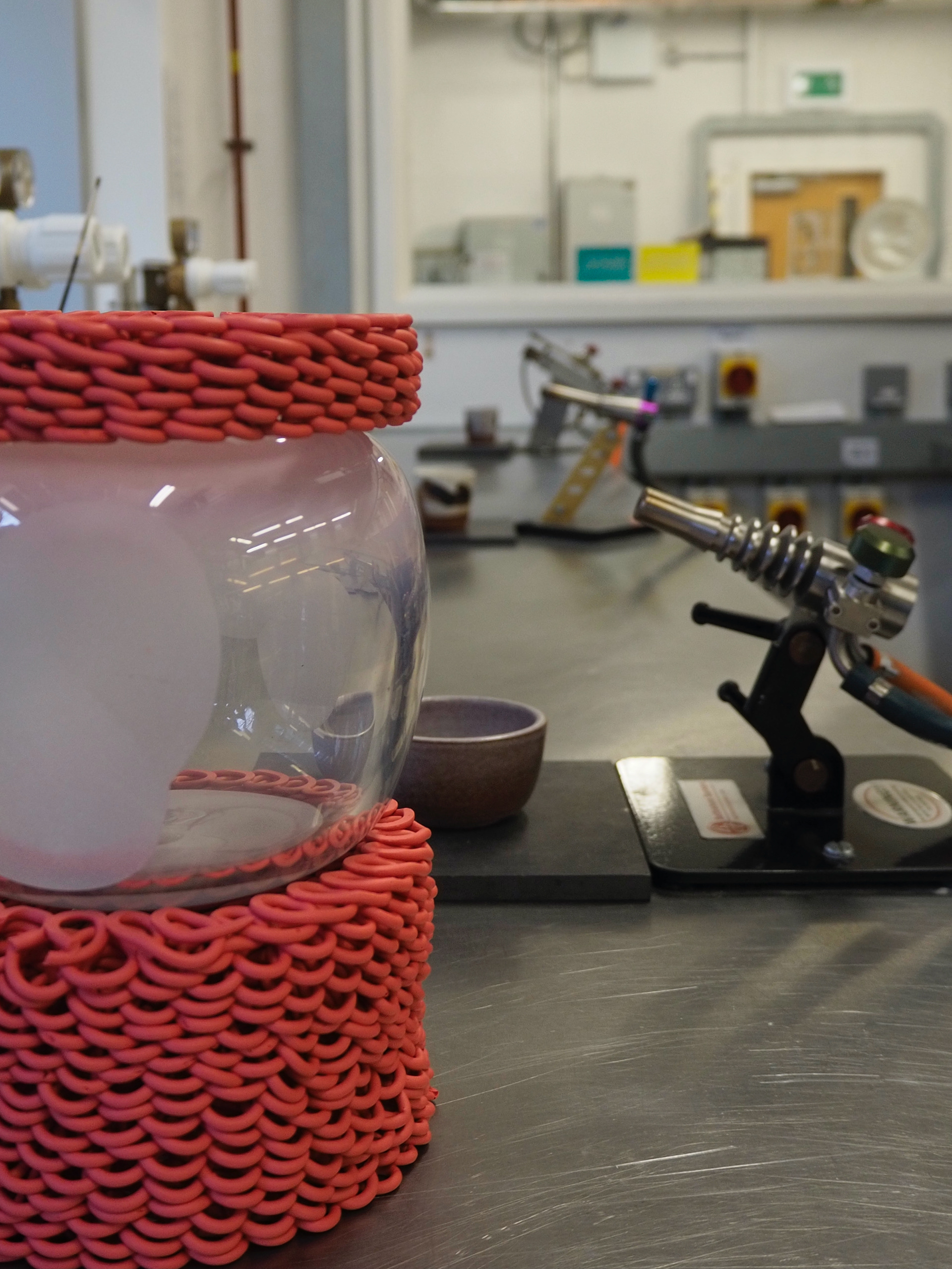
Unfortunately, once this piece was out of the lehr I noticed a few black marks on the bottom side of the glass. I asked the technician what this could be and she said it was black colour leftover on the iron from the previous user. This has never been a problem before because no one has used black in the hotshop at the same time as me.
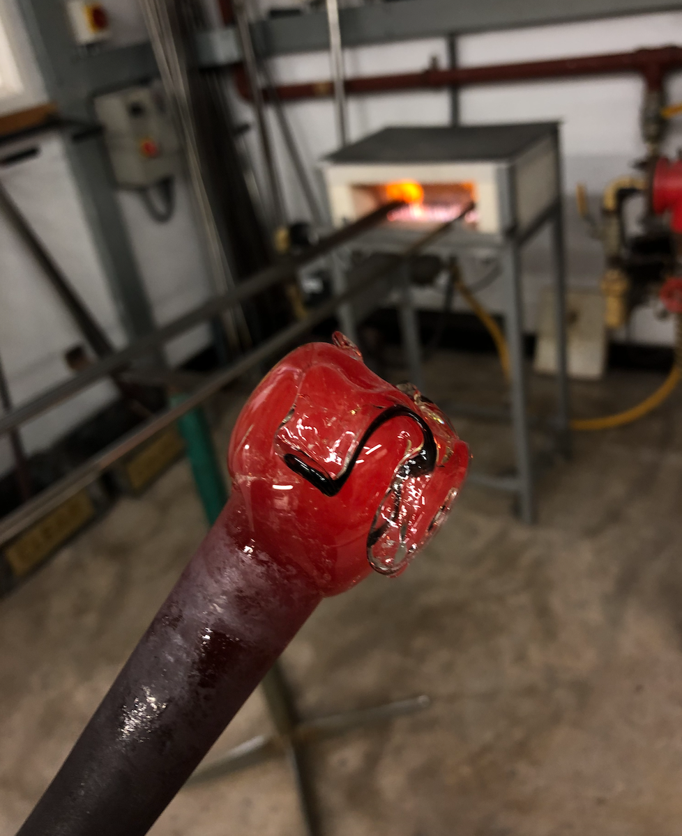
In order to avoid this in the future, I have started cleaning the irons before each use by taking a small gather and using tweezers to pull all the glass off the iron.
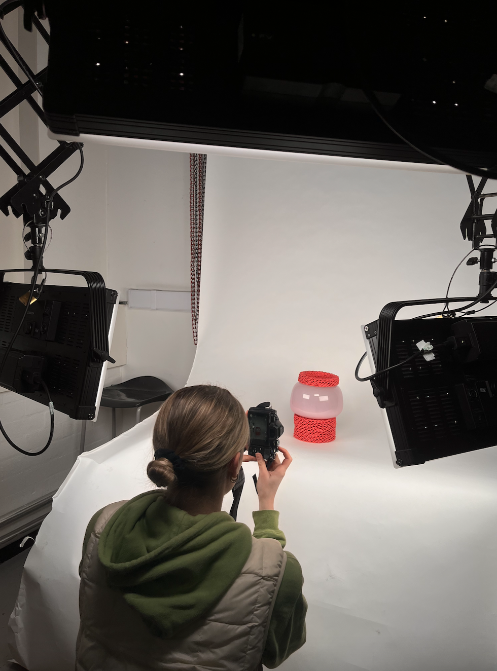
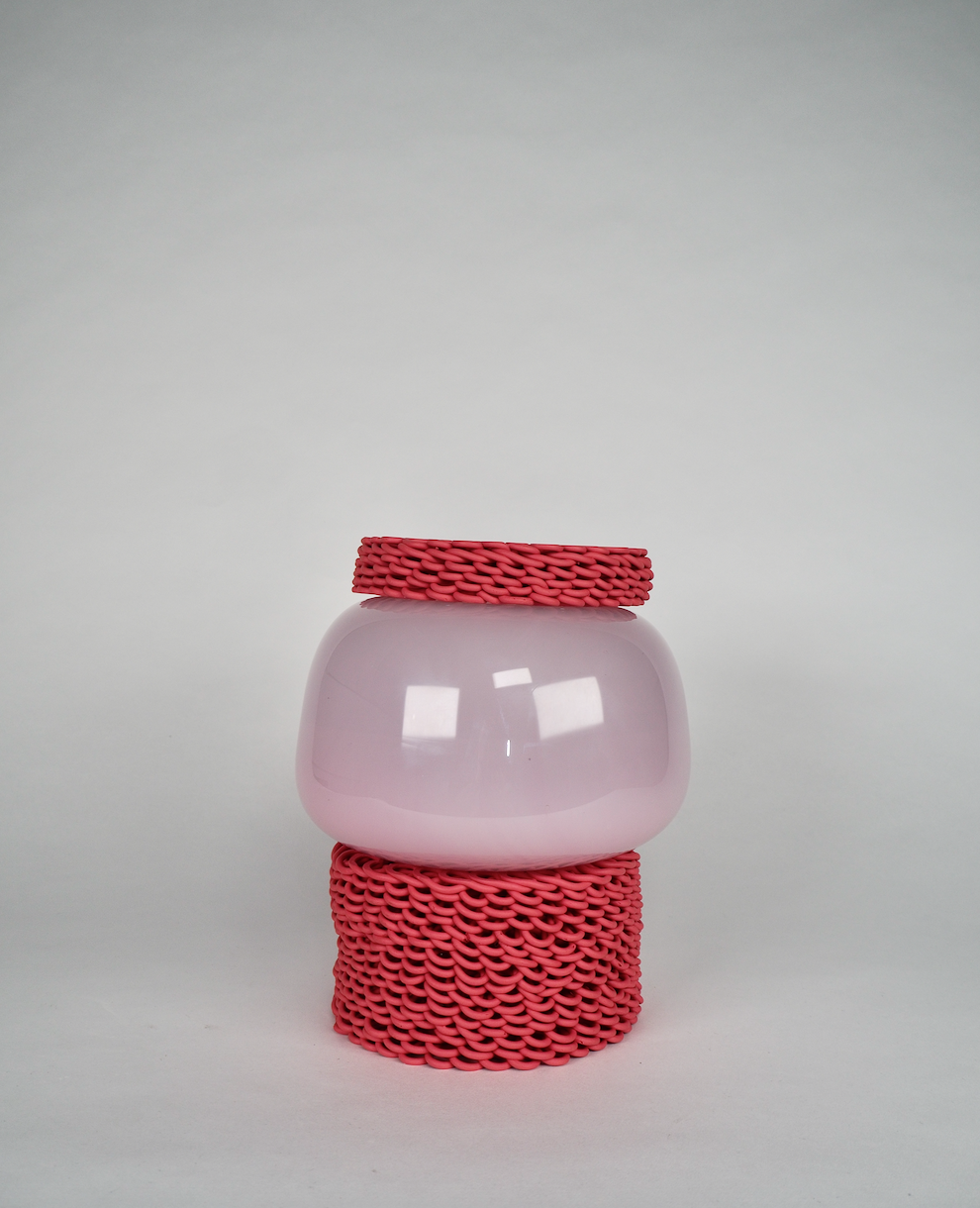
After taking the first two photos, I thought that the stack was lacking. It was too short and stout and you could look into the top and see the glass through the ceramic piece. It felt unfinished so I wanted to make some kind of lid that would give the piece more height and mean that you can't look inside.

Blowing the lid. With this addition this piece has much more of a presence. The ceramic pieces in this stack are slightly too big for the glass components which means that they don't fit fully flush with each other. This can only be seen when looking very close but is something for me to improve on with the blue stack.
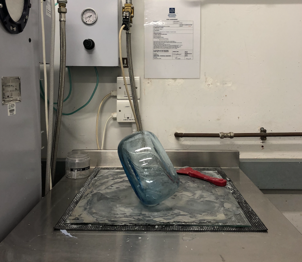
Blowing the bubble for the blue totem. I chose to use a transparent blue for this stack so that I can cold work some lenses into it in order to create an opportunity for visual interactions with the totem.
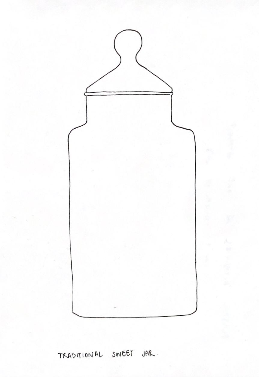
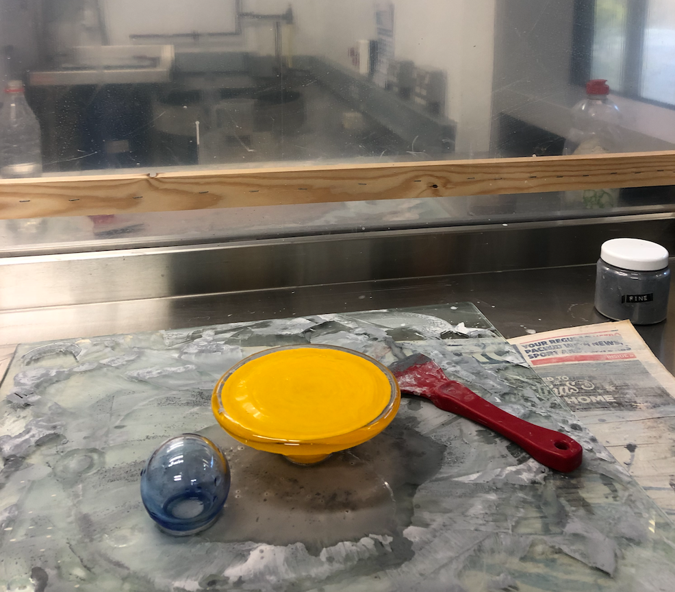
Making some lids inspired by traditional sweet shop jar lids. I was unsure whether I wanted a blue or yellow lid so I made both so I could decide which suited the piece better. Using the chalk as a visual measurement.
Coldworking the glass pieces for the blue totem, including two lenses on the bubble.
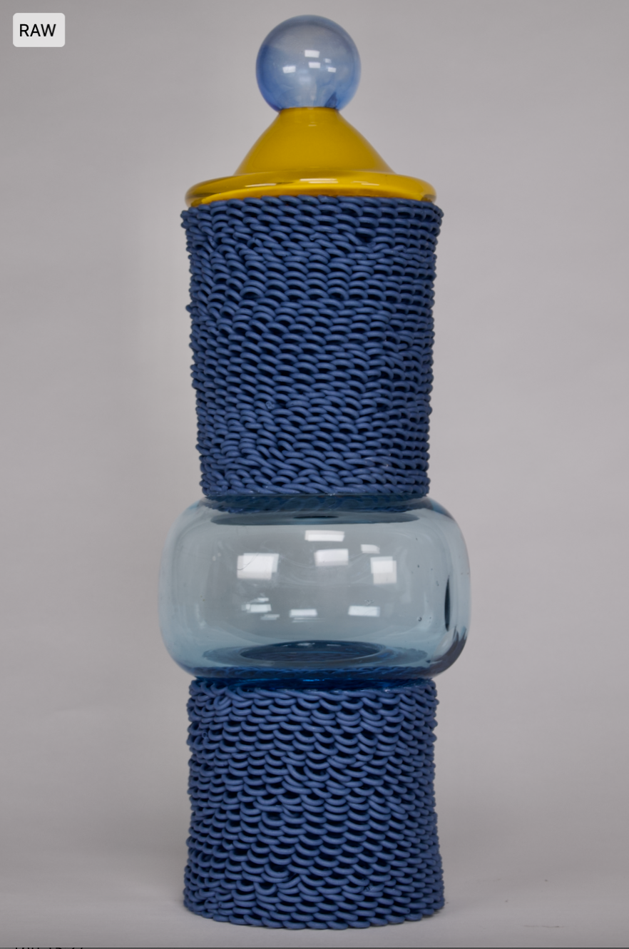
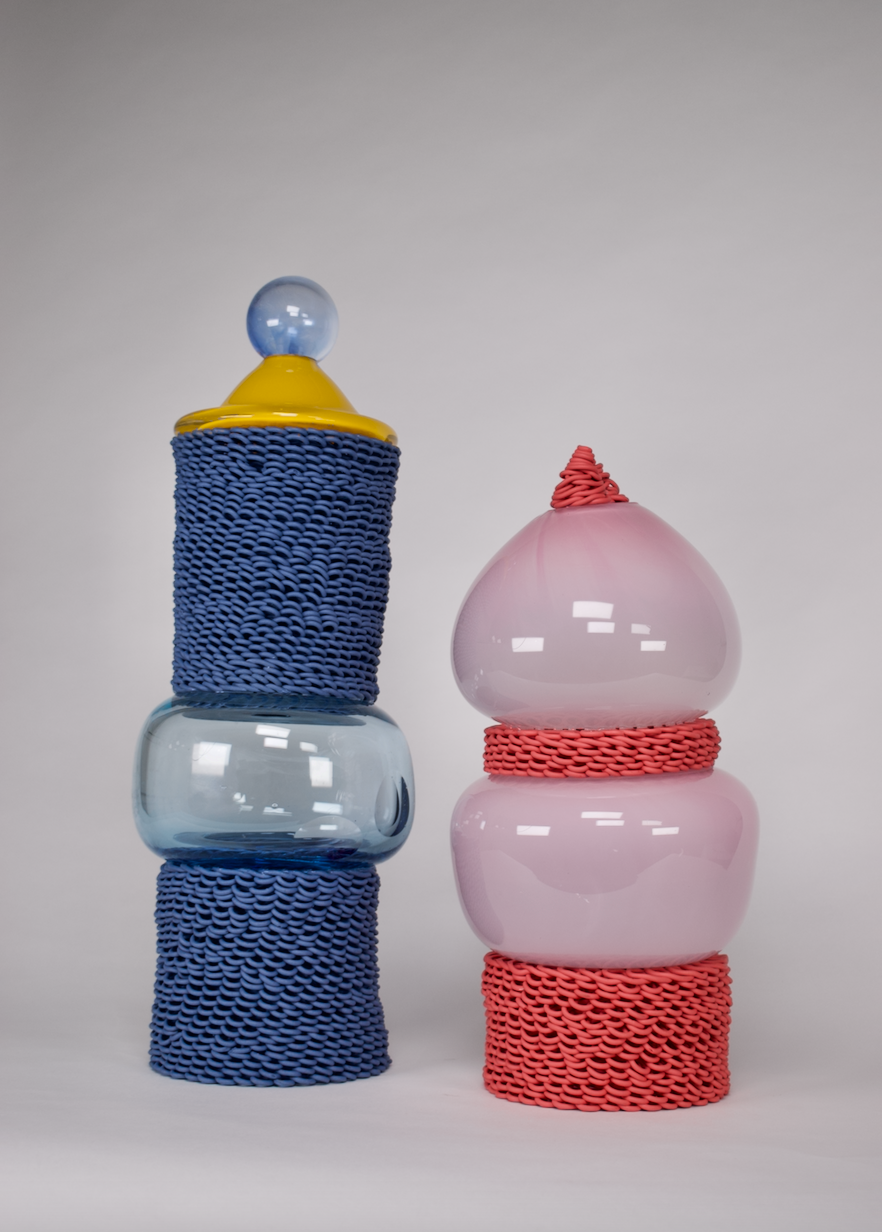
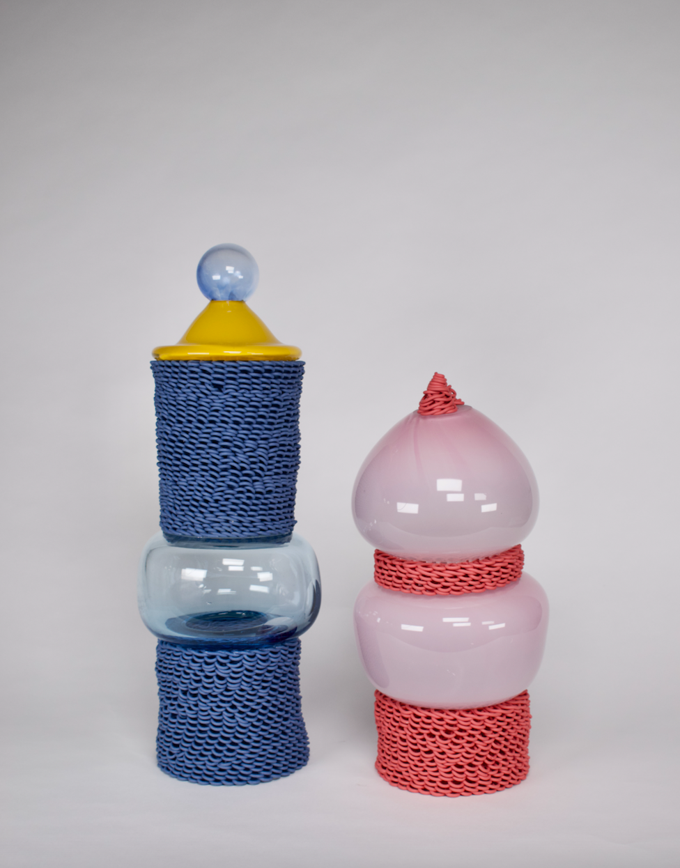
I am happy with how these pieces encompass the notion that playfulness, delicacy, order and chaos can come together to create a sense of lightness. This is what I set out to do and I feel I have done this. However, these pieces aren't perfect, working on a bigger scale had its challenges and I think this can be seen in the execution of the both of the totems. The blue one sits with a lean to one side, this is because the bubble is uneven, but I actually quite like this about the piece, for me it adds character. I didn't realise this until both of the pieces were finished but I do imagine them as little characters with personalities. Although, there are some points to both of these pieces that I don't consider character building, such as the join not being flush on the pink and red totem, which means you can see where it has been glued as well as the condensation inside the lid of the blue totem. These are things that I will address and refine within my unit X work.